

MotifView
Short description: Find the average/median protein positional and occupancy frequency information on a set of given transcription factor binding sites.
The motif view shows the average/median positions of occupying proteins on the instances of a given transcription factor motif (on the whole or a portion of the consensus motif set). The reference point is marked as zero and it represents the center of the motif. The scatter plots provide information about the frequency of co-occupancies and the distance distribution standard deviations of distinct proteins. The latter can correlate with the physical distance between the protein and the DNA (direct or indirect binding). Every dot represents a ChIP-seq experiment, which is colored according to the type of target protein. The displayed dots can be filtered based on cell type/cell line or target proteins.
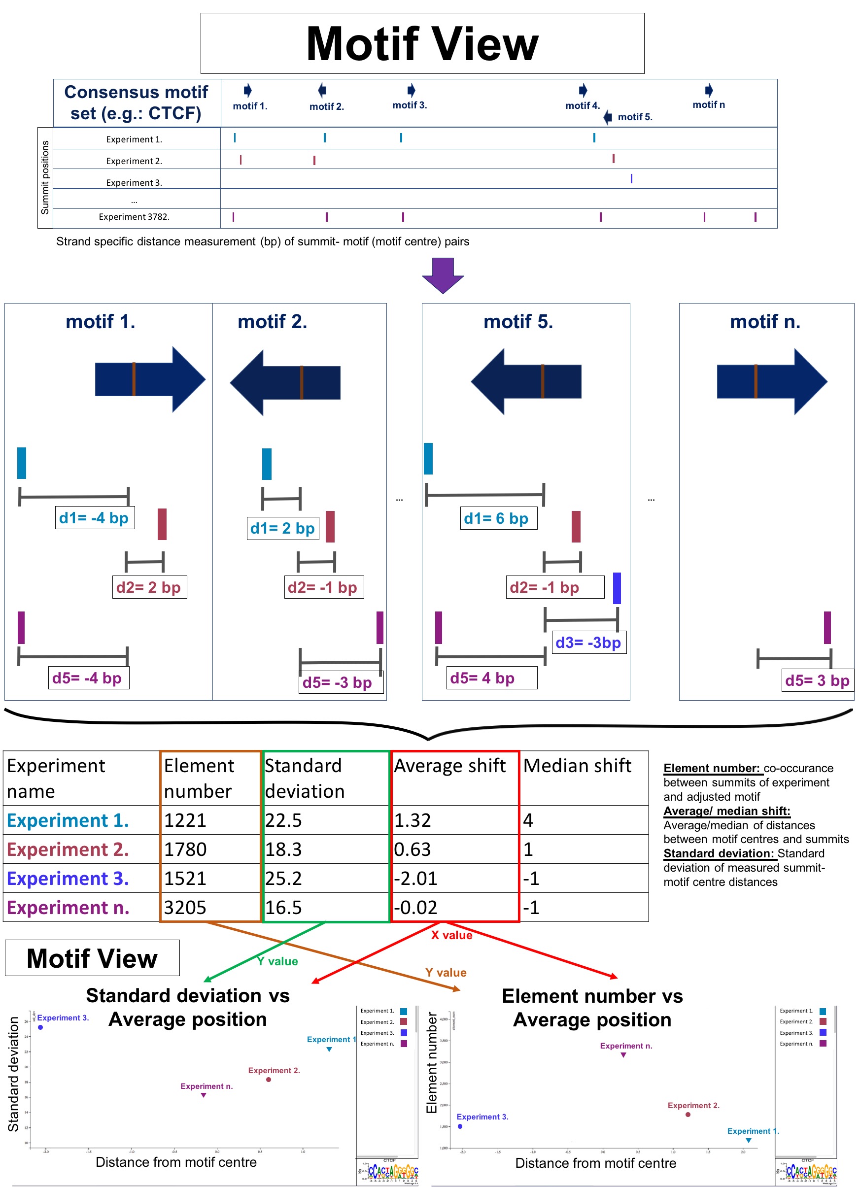
The MotifView appears as an interactive scatterplot, which gives information about the given JASPAR core motif instances in the genome (global analysis of consensus motif set, see above), the overlap frequency between motifs, and ChIP-seq peaks and the average/median positioning of summits from different experiments. Every dot on the chart belongs to a single ChIP-seq experiment. The dots are placed depending on the relation between the positioning information and the adjusted motif center. (The position weight matrix of the adjusted motif is shown in the bottom-right corner. The center of the motif is marked with “0” on the scale below.) The motif of interest can be set in the “Set a motif” dropdown box. In the write boxes, you can modify what data is displayed and the minimum and maximum values of the y axis (standard deviation or element number, this will be discussed later in this description). Important: All of the changes will only be displayed after clicking on the “Resend Data” button below.
If the user hovers the cursor on a given dot, a tool-tip will appear, which gives information about the ChIP-seq experiment, including the name of the experiment, cell type, target protein, and quantified information about summit positions (average/median distance, standard deviation of distances, and overlap number). The dots are colored according to the type of target protein. The legend with color codes is visible on the right-hand side of the chart, which is also interactive. Clicking on a specific target protein name in the legend section can hide the respective dots from the chart. The large amount of displayed dots can be overwhelming in the data review, so we created a “Clear all dots out” button to hide all of the points of the chart. The specific spots can be called back one-by-one by clicking on the factor name in the legend. Using this process, we can compare the positioning of proteins of interest. All of these steps are revocable by clicking on the “Show all dots” button.
The X axis is constant and represents the distance from the center of the adjusted JASPAR CORE motif (the distance is measured in base pairs). The Y axis is adjustable, you can choose to display the number of summit-motif overlaps or the standard deviation of summit positions.
As was previously mentioned, we created consensus motif sets for the JASPAR core motifs, which represent all of the possible binding sites for different factors (documentation link). The power of the ChIP-seq technique resides in its comparability, which means in our case, that we can easily investigate the relationship between motif centers and nearby summit positions. We define this in distances (measured in base pairs) then visualize the average, frequency, and standard deviation on scatterplots. Several motifs show a high density of overlapping summits. Binding sites like CTCF or AR motifs are popular among transcription factors/ co-factors in the case of genomic co-localization. Genomic regions like super enhancers are collectively bound by an array of factors. At the core of these regions are transcription factor motif(s), which is/are covered with a collection of different proteins. Since we investigate whole sets of possible transcription factor binding sites and we visualize the average values of all possible co-localizing factors (the summit positions of these factors), we can run into some rather crowded scatterplots. To resolve this problem, we can use the previously mentioned “Clear all dots out” function or we can utilize the factor unification solution. The latter is based on consolidating different ChIP-seq experiments (even from different cell types), which have a common antibody target. The unification step averages the summit positions of the affected experiments (average of averages), the standard deviations (average of standard deviations), and the element numbers. To activate this display you can choose between two buttons: “average standard deviation vs. average of average positions” or “average element numbers vs. average of average positions”. The two features differ in the values of the y axis. The first one displays the average of standard deviations, the second shows the average number of motif-summit overlaps per experiment.
Interoperability between the different views
The MotifView provides a global picture about the transcription factor binding sites and their occupying ChIP-seq signals. Thus, the MotifView is a genomic bird’s-eye view, which is a useful tool for identifying intriguing phenomena. However, in order to properly understand what we are seeing, we need to be able to take a closer look.
As mentioned in the Help section, the diagram was made to be interactive. The dots on the diagram (which all represent a specific ChIP-seq experiment) can be marked by clicking on them. The attributes (cell line, antibody, SRA ID, element number) of the selected experiments (a maximum of 3 experiments can be selected at the same time) appear below the chart. If you want to investigate the appointed highlighted data, you can choose from the following options:
If you click on the “to PairShiftView” button, it will navigate you to the distance distribution chart of the summit positions (of the selected experiments) compared to the adjusted motif (the same motif, which was displayed in the MotifView).
To browse the genomic locations of peak-motif co-occurrences in the genome browser, click on the “to the GenomeView” button.
You can check the frequency of co-occupancy between the selected factors by clicking on the “to Venn diagram” button. This will open a classical logic diagram display mode, where the motif related co-appearance of summits can be seen.
PairShift View
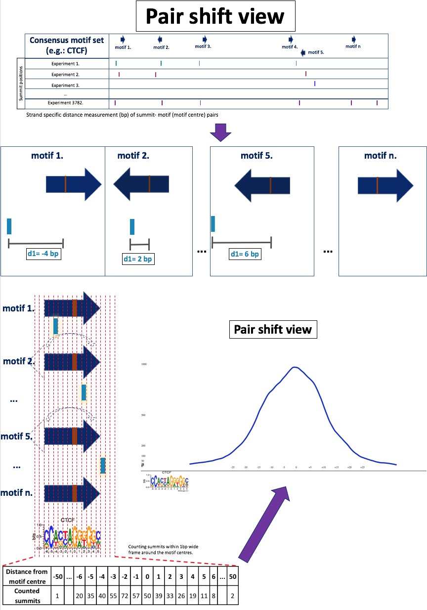
The MotifView displays the statistical data (occurrence frequency, average/median distance related to the motif, and distance standard deviation) of all the ChIP-seq experiments, which contain overlapping peaks with any instances of an adjusted motif type (e.g.: all CTCF motif). The positioning of the different factors related to the motif has a central role in this view but this view’s resolution is too low to see the details of position distribution.
The pair shift view shows the summit distance distributions of the selected ChIP-seq data (a maximum of 3) related to a motif as a histogram. The X axis represents the distance (measured in base pairs) from the middle of the given motif, which is marked as the “0” point. The numbering of the axis is consistent with the position weight matrix below the diagram. The Y axis shows the frequency of summit occurrences at the relative position (at a given base pair) relative to the motif center. In the case of well-defined protein topology with high overlap frequency and close DNA localization, the curve has a bell-like pattern (normal distribution-like). According to our observations, the narrowness of the curve is inversely proportional to the protein’s physical distance from the DNA (direct or indirect binding). This relationship can be detected when looking at the standard deviations as well (MotifView). Factors with low overlap frequency and no position preference show plateau distribution.
To visualize the data, we need to set the options. We recommend that you set the motif first in the dropdown box below “Set a motif”. After you choose a motif of interest, you can set which experiments you want to investigate. (You can select them using the dropdown menus, or you can navigate to pair shift view comparison from motif view after you highlighted the dots (experimental data) that you are interested in. You can read about this in ”Details”, found in the MotifView Help section. To select the ChIP-seq data of interest, set the attributes of the experiment in the dropdown boxes from right to left: in the first box select the cell type, in the second you can pick the antibody, and in the third box you can choose by the name of the experiment. The experiment name is related to the experimental attributes: the tissue type and the origin of the cell type, the target protein name, and the SRA experiment ID. When you set all the parameters, click on the “Resend Data” button. Following the page refresh, the updated data will be displayed. The minimum and maximum values of the axes are configurable as well in the text boxes below the diagram. A rolling mean with a 5 bp frame was applied to smooth the frequency curves.
VennDiagramView
The diagrams of the MotifView cumulatively represent the statistical data of all occupying ChIP-seq experiments (occurrence frequency, average/median distance related to the motif, and distance standard deviation) on all instances (consensus motif set) of an adjusted motif type. The co-occurrence frequency of distinct ChIP-seq summits from different experiments is not taken into account here. To fill this gap, we created a VennDiagram View. The Venn diagram displays all possible logical relations between a collection of different sets. In our case, the sets are the motifs that overlap with the peaks of a chosen ChIP-seq experiment and the relation is the number of common motifs that are simultaneously occupied by these experiments.
ExperimentView
At the early stage of our work, we collected 4068 human ChIP-seq data from public databases (NCBI SRA, ENCODE). 3727 experiments were successfully processed and used in the following steps of the analysis. The basic information of this data is at least as crucial as the final results. As previously mentioned, we tried to use a wide variety of ChIP-seq data considering both the origins (cell type, tissue) and the target proteins. To track the source of the data, we created an “ExperimentView”, which is a more manageable and readable way to browse essential information about the distinct experiments by putting all of the data into a simple table. The search interface of this view is quite similar to the PairShiftView and VennDiagramView.
GenomeView
The
genome browser gives the user opportunity to look at each motif each
peak on the genome. The genome viewer can visualize all consensus
motifs one by one, peaks of each experiment and miscellaneous tracks
including: dbSNP track, known gene track from UCSC and Eensembl
and some regulatory regions tracks. To find information on basic
navigation please refer to the jbrowse help menu on the top left
corner, next to the “view” menu. To add additional tracks please
click on the “select tracks” button. This will bring in a table
to select tracks from. To narrow down the selection table the filters
on the left can be used. To remove the table of tracks please click
on the “select tracks” button again.
dbSNPView
This view helps you to see variations and overlapping regulatory motifs.
If you search by a dbSNP ID, you can see the reference variation, the alternate nucleotides and (if present) the overlapping sequence logos. Every SNP has an ID and a link to the original dbSNP page. The motif logo is also clickable and you can reach the corresponding motif page.
The other way to see the genomic landscape is to specify a region. Because in this case the genomic region can be large, only a schematic view will be seen. The variations marked as lines (red colour indicates overlapping with motifs) and motifs drawn as rectangles. Both the variations and the motifs clickable. The SNP ID link is the same as described above, but the motif has two links! If you click to the name, you will be navigated to the MotifView page, but any other click inside the rectangle work like a zoom. You can see the nucleotides and the motif logo after the page reloaded.
In this zoomed mode if you hoover the mouse overt the SNP, you can see the reference nucleotides in green and the alternative allele in red.
Please specify the dbSNP ID or a genomic region. If both set, only dbSNP will be used. If dbSNP ID is set the final image will be created using 50bp flanking region. If you would like to see a larger landscape, you can set the genomic region manually.
Caution: The genomic region cannot be larger than 1000bp!